

Color, the dynamic force shaping our digital experiences, transcends mere aesthetics. It serves as a silent storyteller, molding perceptions, conveying mood, and imparting vital information. Within the field of design, color stands as a universal language, crafting narratives, defining brand identities, and seamlessly guiding users through interfaces.
Yet, within this vibrant palette, it is imperative to acknowledge color's intrinsic limitations, particularly regarding informational design. While color excels as a communicator, challenges arise when it becomes the exclusive messenger, as highlighted by the accessibility guideline SC 1.4.1: "Don't use color alone to convey information."
SC 1.4.1: "Don't use color alone to convey information"
SC 1.4.1, an abbreviation for Success Criterion 1.4.1 in accessibility standards, is not a mere bureaucratic decree. It stems from a collective effort to ensure that digital content is accessible to all, irrespective of their abilities or challenges. Developed by experts in the field, this guideline is a testament to the commitment to inclusivity in design.
The Call for Inclusivity
Why does SC 1.4.1 matter? It stands as a fortress against the exclusive use of color in conveying information. By embracing this guideline, designers acknowledge the diverse ways in which users interact with digital content. It is a call to break down barriers and make information universally comprehensible.
Importance in Practice
Imagine a digital landscape where color is the sole messenger—an environment that poses hurdles for those with visual impairments. SC 1.4.1 urges designers to go beyond aesthetics, recognizing that accessibility is not an afterthought but a core element of good design practice.

By incorporating secondary indicators, utilizing shapes and patterns, and providing descriptive alternatives, designers adhere to SC 1.4.1, creating a more inclusive design language. This not only meets the needs of specific user groups but elevates the overall user experience for everyone.
In conclusion, SC 1.4.1 is not a mere guideline; it is a beacon guiding us towards a design language that resonates universally. Let us embrace it with purpose, understanding that in doing so, we contribute to a digital tapestry where every user is considered, and every interaction is meaningful.
However, the dominance of color in communication poses challenges for individuals with visual impairments, as emphasized by SC 1.4.1. This underlines the importance of designers embracing inclusive practices.
The nuanced spectrum of color, spanning warm to cool tones, enables the creation of immersive experiences, signaling meaning, emphasizing essential elements, and establishing a visual hierarchy for comprehension.
Color's Crucial Role in Accessibility
Examining the complexities of color communication in design uncovers a context where thoughtful consideration goes beyond aesthetics. For individuals with color vision deficiencies, commonly known as colorblindness, the challenge lies in perceiving nuances that others might take for granted. Colorblindness is a visual impairment where certain colors are difficult to distinguish, and in some cases, individuals may see a limited range of colors.
Cognitive disabilities add another layer to the equation. Complex charts and data visualizations may present obstacles for those with cognitive impairment. Simplifying information, utilizing clear language, and minimizing distractions not only enhance accessibility for this specific group but contribute to an overall user-friendly experience.
Beyond specific challenges, the broader audience also reaps rewards from these considerations. Implementing secondary indicators, offering variations in shapes and patterns, and providing descriptive alternatives to visual content contribute to a more inclusive design. This approach enhances clarity and comprehension for everyone, creating a seamless digital experience.
In the color communication domain, addressing these challenges is not just about meeting the needs of individuals with specific conditions—it's about refining the language of design to resonate universally. As we navigate the intricacies of color in communication, we aim to create a design language that speaks clearly to all users, regardless of their abilities or challenges. In the subsequent section, practical strategies will be displayed to achieve this vision, ensuring that the design communicates effectively and inclusively.
Good Practices for Color Accessibility
Relying on color alone to communicate information erects barriers for many readers. Colorblind and low-vision users may struggle to perceive color differences, and screen readers (assistive technology tools designed to audibly convey the content of digital interfaces to users who are blind or visually impaired) omit color information for non-sighted readers.
Secondary Indicators for Linked Text
When it comes to linked text, ensure accessibility by incorporating a secondary indicator beyond color. Whether it's underlined, bold, or set against a distinct color background, this additional cue aids users in recognizing interactive elements, especially for those who rely on more than just color cues.

Differentiating Elements in Charts
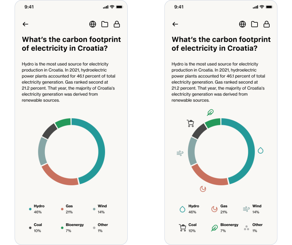
Charts are powerful visual aids, but their effectiveness diminishes when reliant on color distinctions alone. To enhance accessibility:
- Change Shapes and Patterns: Introduce variations in shapes and patterns along with color-coded elements (represent information conveyed through specific colors). For example, use different shapes for data points or elements and incorporate varying patterns to enhance clarity.
- Provide Visual Differentiation: Ensure visual cues beyond color, making it easier for users with color-related challenges to interpret the information.
- Use patterns and textures: Color differences are incredibly important with data visualization, e.g., graphs and pie charts. Choosing colors with a low contrast ratio can make your chart difficult to interpret for colorblind users. Instead, use patterns and textures to make it easy for users to differentiate different segments.
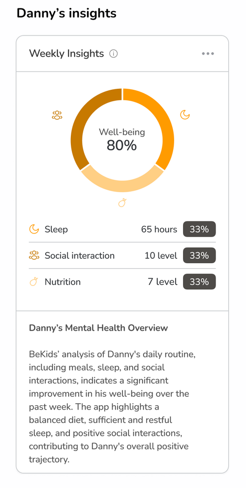
- Offer Text Alternatives: Provide descriptive text alternatives for complex charts and graphics. This not only assists users with visual impairments but also enhances overall comprehension.
- Add text labels to segments: Enhance understanding by adding text labels to segments, making them even easier to comprehend.
Error Messages with Visual Icons
In addition to using a differentiated color, incorporate visual icons, such as an exclamation point, alongside error messages. This dual communication approach not only alerts users through color but also provides a clear visual indicator for those who may not perceive color changes. It's a simple yet effective method to ensure that important messages are conveyed universally.

Color Pitfalls: Combinations to Avoid
Color combinations play a key role in design, particularly for users with color-related challenges. It's crucial to steer clear of certain combinations that may pose difficulties due to low contrast ratios or challenges in differentiation. Consider the following list when creating your interface designs:
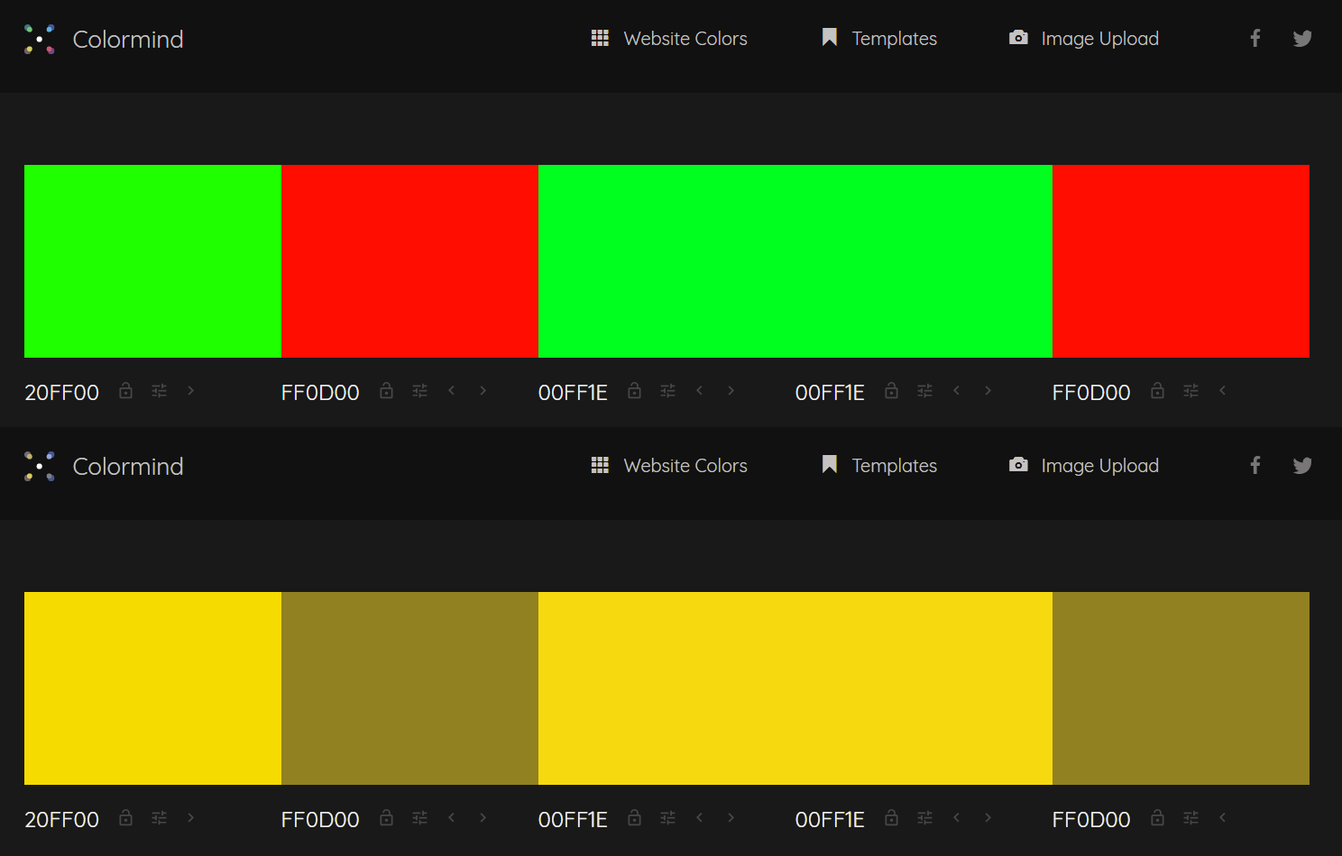
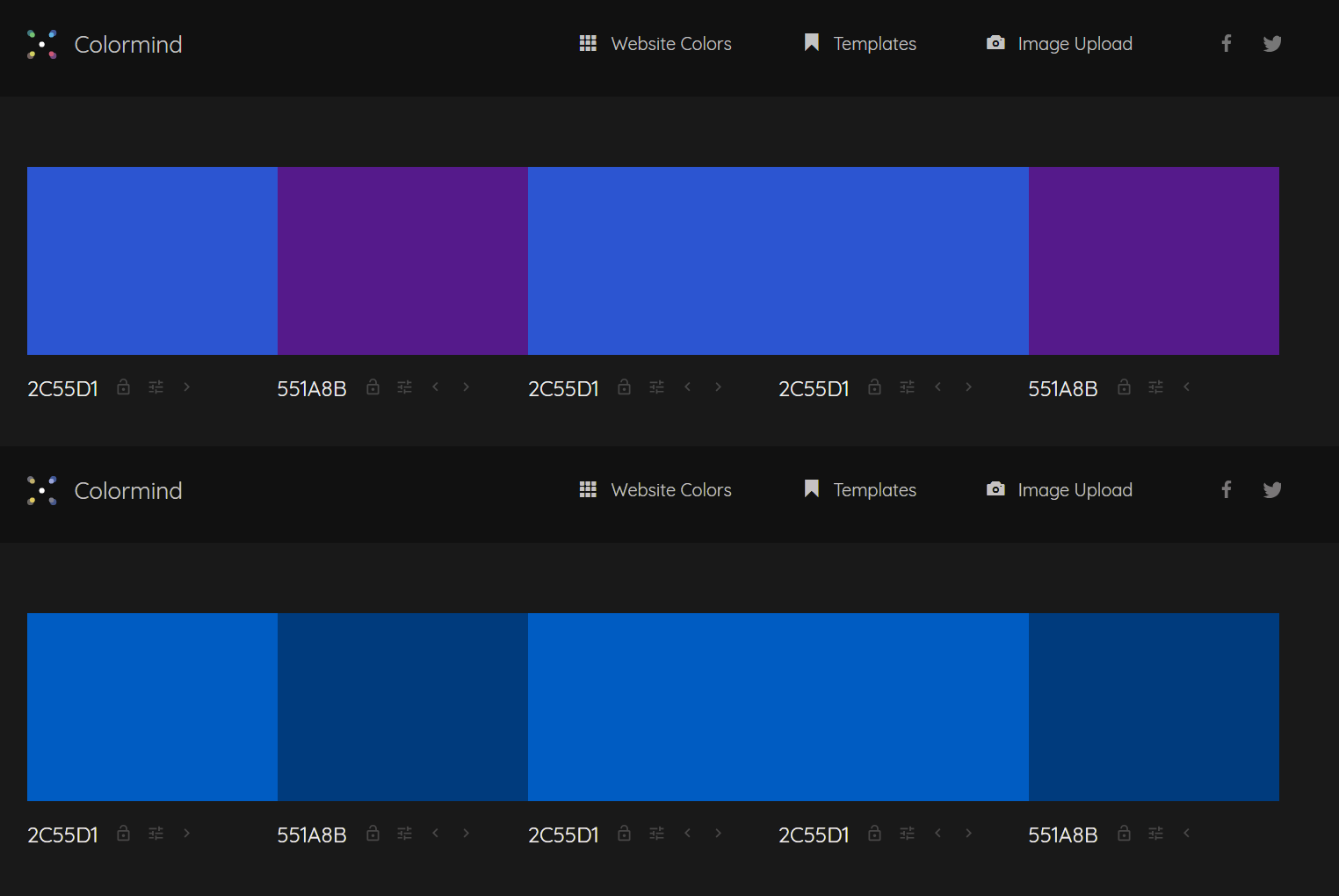
- Green-Red
- Green-Blue
- Green-Brown
- Green-Black
- Green-Grey
- Blue-Grey
- Light Green-Yellow
- Blue-Purple
Protanopia is a form of color blindness, specifically a red-green color deficiency. Individuals with protanopia have difficulty perceiving red light, making it challenging to distinguish between certain shades of red and green. As a result, design choices relying heavily on these color combinations may cause confusion or hinder comprehension for users with protanopia.
By avoiding these color combinations in your designs, you pave the way for a more inclusive user experience, ensuring that information is accessible and comprehensible to a broader audience.
Reflecting on Design's Colorful Journey
As we conclude this exploration of color communication in graphic and UX/UI design, it's evident that color is more than just a visual embellishment; it's a narrative thread woven through the fabric of digital experiences. Our journey through the vibrant palette of hues has underscored both the power and potential pitfalls of relying on color as a primary communicator.
In the symphony of design, where color orchestrates emotions and guides interactions, it's crucial to heed the call for inclusivity. The echoes of accessibility guidelines remind us that our design decisions impact diverse audiences. From the warmth of inviting tones to the cool precision of information hierarchy, every shade plays a role.
The brush strokes of good practices offer a nuanced approach, recognizing that relying solely on color erects barriers. Linked text gains clarity with secondary indicators, charts become more eloquent when speaking a language of shapes and patterns, and error messages resonate universally with the harmony of visual icons.
In this final stroke, let's not just appreciate color; let's understand it as a communicator transcending barriers and connecting us all in the diverse design tapestry.