
In the digital world, the essence of inclusivity takes center stage. Web accessibility, a cornerstone of this philosophy, ensures that everyone can navigate and interact seamlessly with online content regardless of ability. While the broader concept of accessibility is well understood, this article aims to narrow the focus to a vital component of the online experience: web forms.
Why forms? You might ask. Forms serve as the bridge between users and digital interaction, from login pages to e-commerce transactions. As we embark on this exploration, we'll delve into the profound impact that accessible web forms can have on user experiences. Join us in unraveling the layers of inclusive design and ensuring no digital door remains closed for any user.
Understanding the Impact of Accessible Forms
Web accessibility isn't just a buzzword; it's the foundation of a digital world where everyone can participate. When it comes to forms, the challenges are vast.
Screen readers stumble through poorly labeled fields, and those with motor impairments face difficulty navigating complex form structures. It's not about ticking boxes; it's about breaking down barriers in the digital landscape.
Inclusive design is not a checkbox on a compliance list; it's a mindset that shapes digital environments for everyone. As we explore accessible forms, remember that these principles aren't mere guidelines; they are the keys to creating a digital space where everyone feels included and empowered.
Good Practices for Accessible Forms
Creating an inclusive digital space begins with the thoughtful design of web forms. As the conduits through which users engage with online content, accessible forms not only break down barriers for those with disabilities but elevate usability for all.
Let's delve into 5 key good practices that pave the way for form accessibility:
1. Clear and Concise Labels and Instructions
One of the fundamental pillars of accessible form design is the clarity of labels and instructions. Labels should transcend mere visual elements; they should be explicitly tied to form controls using the "for" attribute. Embrace semantic HTML with tags like <label> and <fieldset> to provide structure. Utilize the aria-describedby attribute to link instructions directly to their corresponding form controls, ensuring that assistive technologies capture the necessary context.
Example:
<form>
<label for="username">Username:</label>
<input type="text" id="username" name="username">
<fieldset>
<legend>Personal Information</legend>
<label for="firstname">First Name:</label>
<input type="text" id="firstname" name="firstname">
<!-- Additional form fields can be added here -->
</fieldset>
</form>
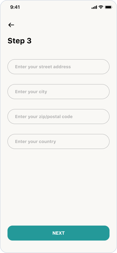
2. Visible Labels and Placeholder Independence
Accessible forms hinge on the use of visible labels. Relying solely on placeholders for conveying essential information poses challenges, especially for users relying on screen readers or those with cognitive impairments. Each form field should boast a clear, visible label associated with it. This not only aids users in understanding the purpose of the field but also ensures that the information remains accessible throughout the entire form-filling process.
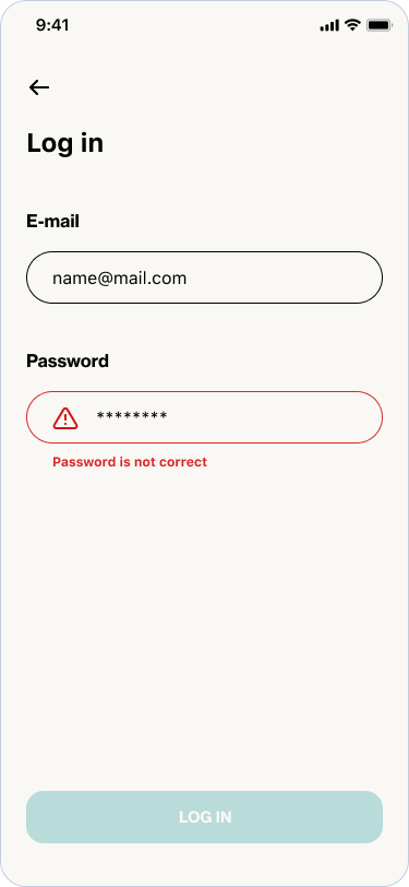
3. Error Messages Matter
When communicating errors, there are two effective options:
- Text-Based Error Indication: Utilize semantic HTML to associate error messages directly with corresponding inputs. Ensure the error message explicitly includes the word "Error." This approach benefits users relying on screen readers or those who may not perceive visual indicators.
- Icon-Based Error Indication: Alternatively, use a visual indicator such as an error icon. Ensure the icon has alternate text explicitly stating "Error" for screen readers. This option provides a clear visual cue for users who may benefit from graphical elements.
Ensure a clear association between errors and inputs by using the aria-describedby attribute. This attribute links the input field to its corresponding error message, facilitating a more straightforward navigation experience for users.
In most cases, default color contrast may not be sufficient. Ensure that your form design prioritizes color combinations adhering to WCAG guidelines. Choose colors that provide enough contrast between text and background, improving overall legibility and accessibility.
Example:
<form>
<label for="password">Password</label>
<input type="password" id="password" name="password" aria-invalid="true" required aria-describedby="passwordError">
<span id="passwordError" role="alert" aria-live="assertive">
<img src="error-icon.png" alt="Error"> Password is not correct
</span>
</form>
4. ARIA Roles for Enhanced Accessibility
Enhance the accessibility of your forms by leveraging ARIA roles judiciously. ARIA, which stands for Accessible Rich Internet Applications, introduces attributes like role specifying the type of element on your webpage. For instance, you can use role='form' it for the overall form, indicating to assistive technologies that it's a form element.
Assign attributes such as role='group' for related fields within a fieldset, and role='textbox' for input fields. This provides crucial information to assistive technologies about the structure and purpose of each element, ensuring a more inclusive experience.
Additionally, utilize attributes such as aria-label and aria-labelledby to provide an extra context where necessary. These measures, combined with ARIA attributes for dynamic content updates, contribute to a seamless and enriched user experience.
In the example below, notice the use of ARIA roles to define the form, groups, and text boxes, making the form more accessible:
<form role="form">
<h1>Contact Information</h1>
<fieldset role="group">
<legend>Personal Information</legend>
<label for="firstName">First Name:</label>
<input type="text" id="firstName" role="textbox" aria-label="First Name">
<label for="lastName">Last Name:</label>
<input type="text" id="lastName" role="textbox" aria-label="Last Name"></fieldset>
<fieldset role="group">
<legend>Contact Information</legend>
<label for="email">Email:</label>
<input type="email" id="email" role="textbox" aria-label="Email">
<label for="phone">Phone:</label>
<input type="tel" id="phone" role="textbox" aria-label="Phone">
</fieldset>
<button type="submit">Submit</button>
</form>
5. Visual Indication of Required Fields
In the pursuit of creating truly accessible web forms, it's crucial to provide clear visual cues for required fields. Users of varying abilities should easily identify which fields are mandatory to complete. Consider the following practices for ensuring visual indication of required fields:
- Employ the HTML required attribute for each mandatory form field: This attribute signals browsers that certain fields must be filled out before submission. Additionally, this attribute can be leveraged to implement visual styling indicating the required nature of the field.
- Enhance the visibility of required fields through distinct visual styling: This can include bold labels, asterisks (*) next to required fields, or a different background color. Strive for a design that is noticeable and easily distinguishable.
Note: If using an asterisk (*) to denote required fields, it's essential to include a clear indication above the form, specifying that the asterisk signifies mandatory fields.
Testing and Continuous Evaluation
Creating accessible forms is a dynamic process that requires ongoing attention.
Regular testing ensures that your digital space remains inclusive and user-friendly. Conduct usability tests with individuals who have diverse abilities, incorporating their feedback to refine your design.
Consider implementing automated accessibility testing tools to identify potential issues efficiently. These tools can catch discrepancies that might be overlooked during manual inspections.
Remember that accessibility standards and technologies evolve. Stay informed about the latest updates, and be ready to adapt your forms accordingly. Regularly evaluate your digital environment to address emerging challenges and embrace new solutions that enhance accessibility.
Digital inclusivity, and commitment an ongoing journey. By prioritizing testing and continuous evaluation, you not only meet current standards but also future-proof your digital space for a more inclusive tomorrow.
Last Reflections
Creating accessible forms is a dynamic process, an ongoing journey of commitment to digital inclusivity. By prioritizing testing and continuous evaluation, you not only meet current standards but also future-proof your digital space for a more inclusive tomorrow.
Each decision holds the power to either reinforce or break down barriers. Beyond compliance, the goal is to create a digital sphere that welcomes and accommodates everyone, regardless of their abilities.
As we move forward, let's collectively contribute to a future where technology serves everyone, leaving no digital door closed. Together, we shape a digital landscape that is not just accessible but genuinely inclusive.
While this article delves into the technical intricacies of creating accessible web forms, it's essential to recognize the broader context of digital inclusivity. For a more comprehensive understanding of accessibility principles, consider exploring our earlier piece, "Making Digital Healthcare Products Available and Accessible to Everyone". This broader discussion covers overarching strategies, societal impact, and the evolving landscape of accessibility beyond the realm of technical implementation. Together, these articles aim to empower you with a holistic view, ensuring that your digital endeavors align with the principles of inclusivity at every level.